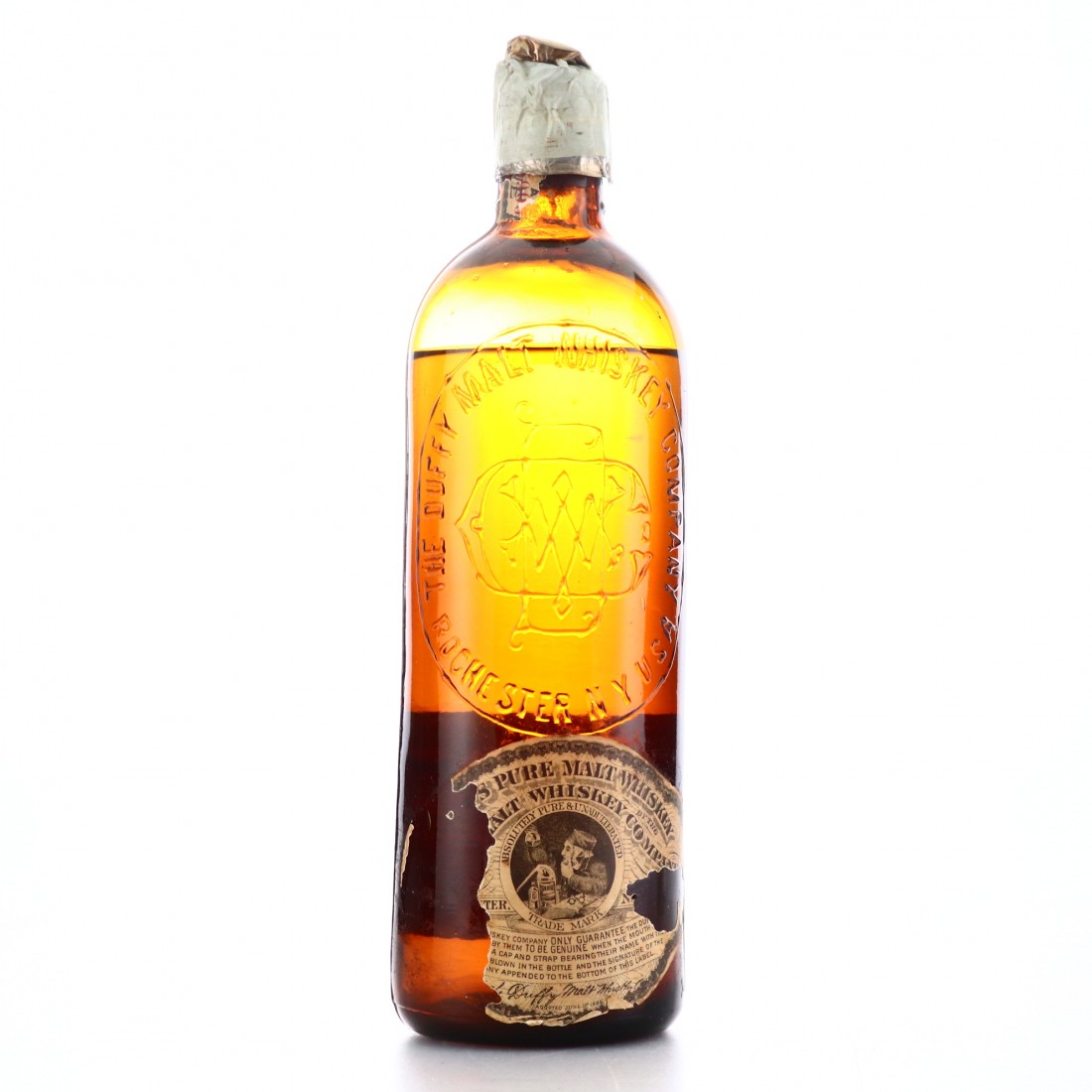
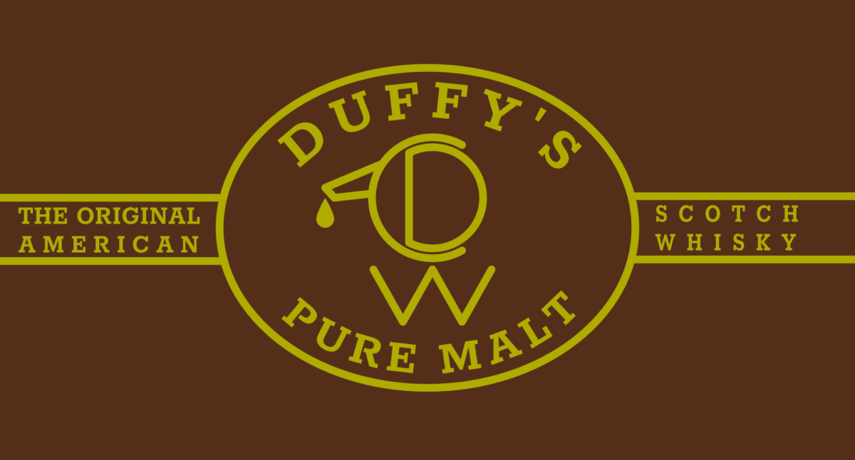
For my Task 1, I chose to revitalise and modernise the brand image of a formerly popular, but now very obscure and long-discontinued, single-malt whisky named Duffy’s, and imagine what its identity might look like if somebody were to return it to production, a prospect that is not implausible given the current boom in craft spirits. This is an example of Principle 7 – Design from Patterns to Details and Principle 8 – Integrate Rather than Segregate, as I drew inspiration from both the DWC monogram logo and their secondary alembic logo to create my new logo, which is a modernised, simplified combination of the two old logos – a monogram made of the letters D, W and C arranged to represent an alembic with a flame underneath it.
Old bottle:
Rebranded logo:
You must be logged in to post a comment.