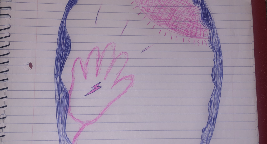
The featured image I uploaded is the final version I chose to create, which is slightly different from the one I presented in lab. Although the theme and concept stayed the same, I made a slight addition to this version that was not in the original permaculture logo. For my permaculture logo, I chose to represent the principle “Catch & Store Energy”. In the center of the drawing, I created a sun to represent energy. The rays of the sun are shining on the palm of a hand which has a lightning bolt on it. This is supposed to represent energy being “caught” and stored. The oval that encapsulates the hand and the sun is supposed to be a mitochondria. I thought this would be fitting because the mitochondria is the powerhouse of the cell, which can be related to nature in a multitude of settings. All natural things, such as plants, have cells which all have organelles such as mitochondrias. The reason I chose this specific principle, is because I thought it would be the most interesting to create a logo for. It could help tech become more humane, by representing a more eco-friendly source of power. In today’s world, a common source of energy would be fossil fuels. With this logo, it could represent solar energy which is a more sustainable and healthier alternative for the environment. A short phrase to help designers remember it would be, “The mitochondria is the powerhouse of the cell”.
One sentence description: Catching & Storing Energy. I chose this description because it seems to be very obvious.

Cant see your image??
I updated the image. It should be visible now, I originally uploaded the wrong file format.