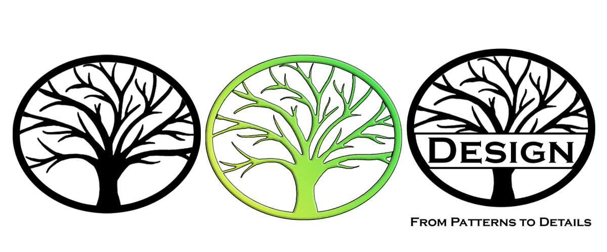
The principle of permaculture I chose to base my logo design on is “Design from Patterns to Details”. This principle emphasizes observing and using nature and natural patterns in design, embracing what is already established rather then trying to fight against it or create something new. This concept really stood out to me because of how simple yet effective it is, and because I saw how easily I could apply the same philosophy to a multitude of contexts other then design. As stated in the article, the natural world is full of observable patterns. One obvious example of applying this principle is choosing to plant crops in an area that sees more frequent rainfall then others. A more abstract example might be in group projects, and making a conscious effort to assign each member a task in an area where they excel in. When it comes to designing humane technology, this principle signifies being efficient as possible with limited resources, and highlights the importance and usefulness of preservation.

To best represent this principle as a logo, I decided to take the definition literally and use the natural pattern of a branching tree as my design. I took a silhouette of a tree and modified it to try and look aesthetically pleasing inside of a circle, creating detail inside the negative space of the branches and an almost optical illusion depending on the proximity you look at it from. This extra detail that is created from the design of the tree well suits the principle.

My one sentence description of the principle for my logo would be “use what we have efficiently”. For technology, this can mean anything from innovating preexisting hardware instead of starting from scratch, to a company becoming more sustainable to combat climate change.


I really enjoy the detailed yet simple look of your logo. I personally favor the black and white approach with the serif font. It captures that natural yet deliberate look. Good Job!
Thank you!