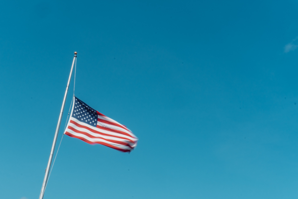
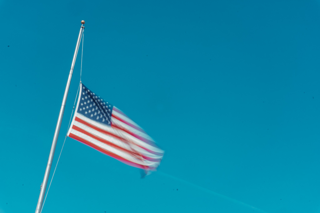
Content–
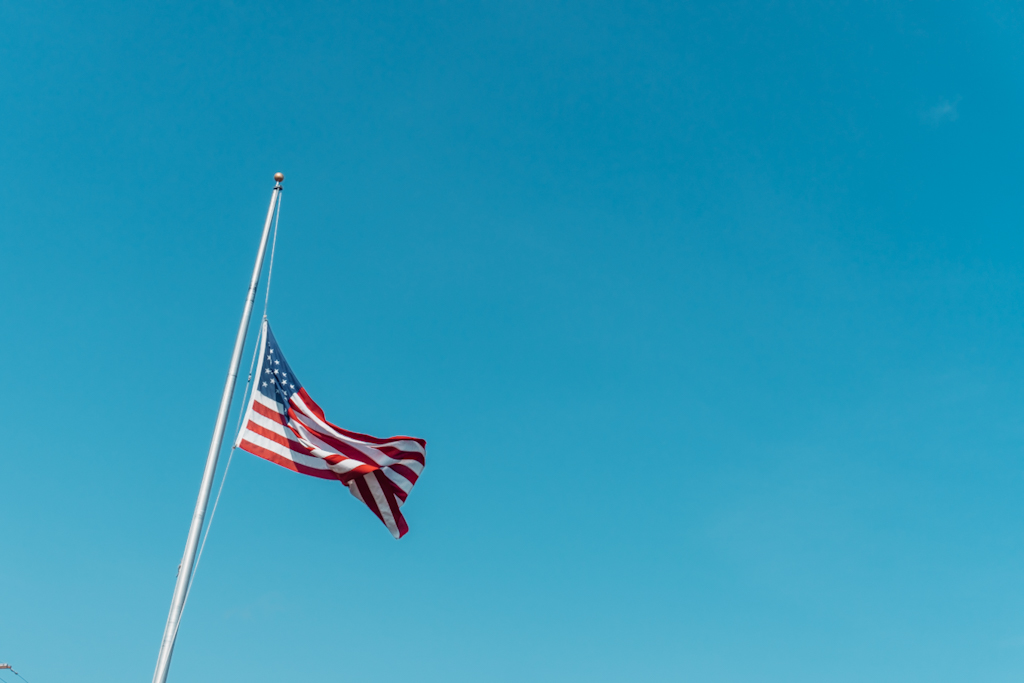
I really like the framing of the flag on the second series. Having the flag be the only object the eye focuses on really makes an impact against the stark blue sky.
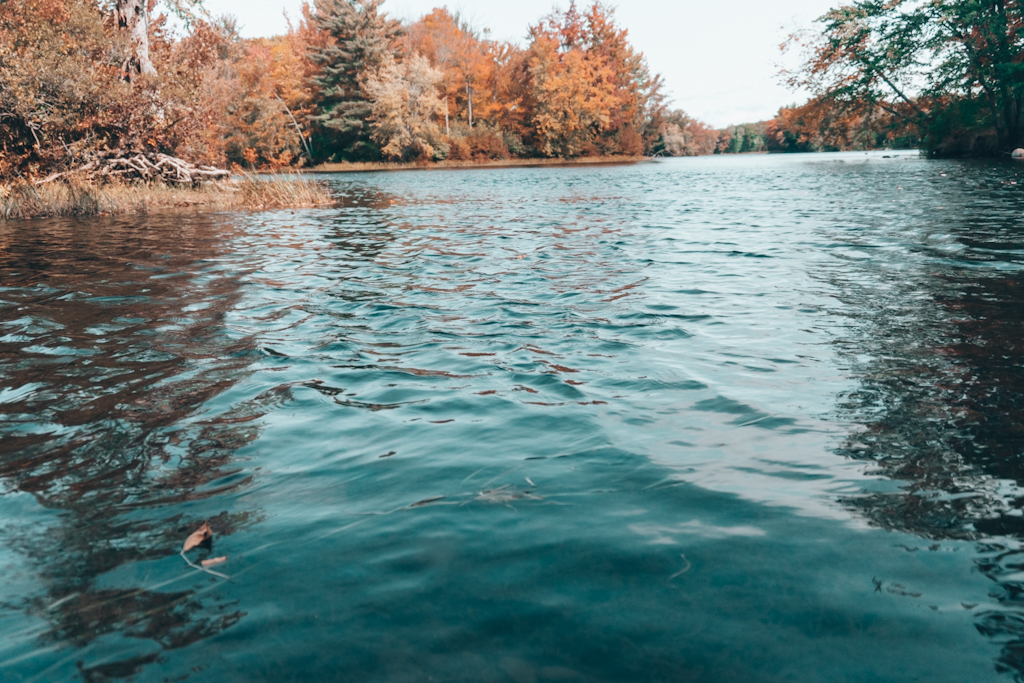
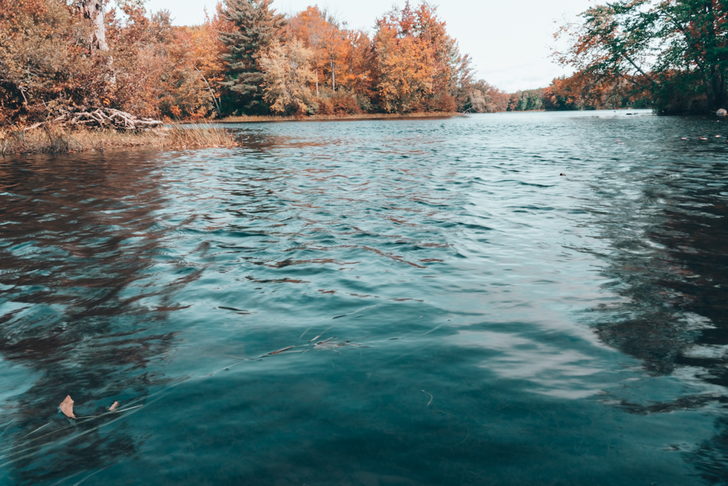
Composition–
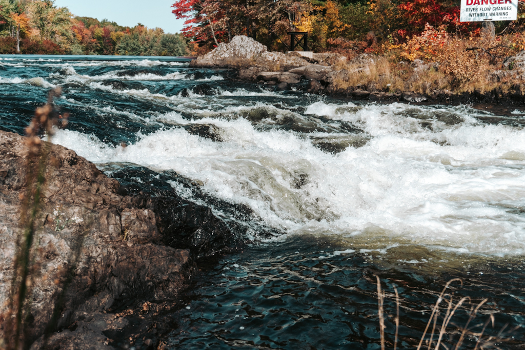
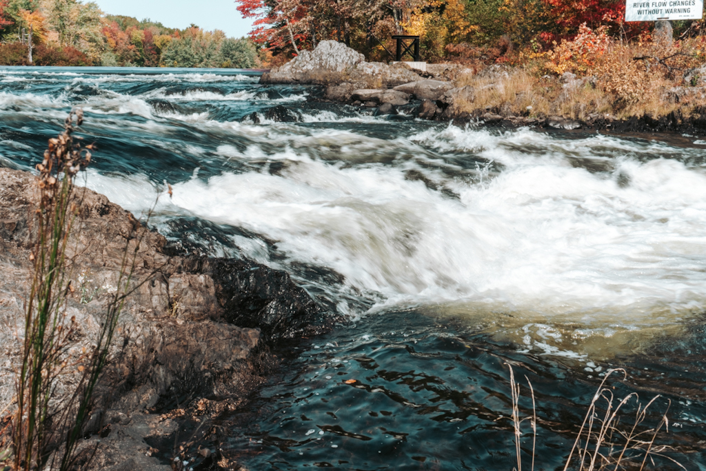
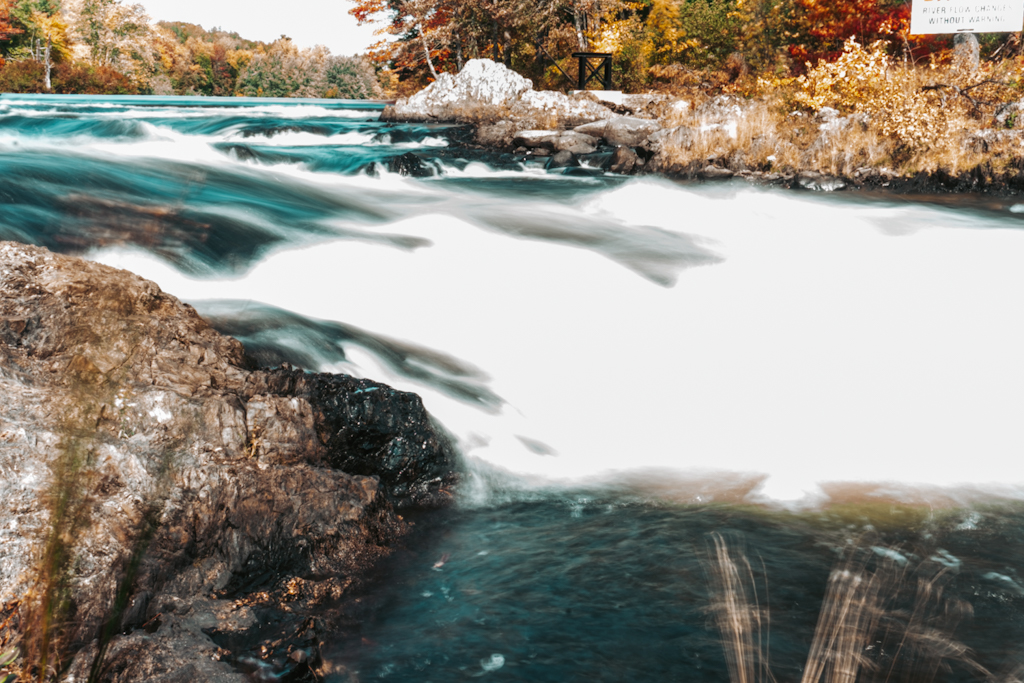
The gradient in the second series is interesting and leads the eye. I also really like the contrast in the first series, with the angle of the rapids creating conflict in the frame, while the rest of the background and foreground don’t have a lot of “noise”.
Technique–
You have a good grasp of technique because you can see the action and movement in the frame, but it doesnt take away from the comprehension of the subject.
Aesthetics–
I like the way that you edited the photos, I think that the color balance and contrasts are interesting and eye pleasing.
October 1, 2020 at 9:57 am
Content–
I really like the framing of the flag on the second series. Having the flag be the only object the eye focuses on really makes an impact against the stark blue sky.
Composition–
The gradient in the second series is interesting and leads the eye. I also really like the contrast in the first series, with the angle of the rapids creating conflict in the frame, while the rest of the background and foreground don’t have a lot of “noise”.
Technique–
You have a good grasp of technique because you can see the action and movement in the frame, but it doesnt take away from the comprehension of the subject.
Aesthetics–
I like the way that you edited the photos, I think that the color balance and contrasts are interesting and eye pleasing.
October 1, 2020 at 10:01 am
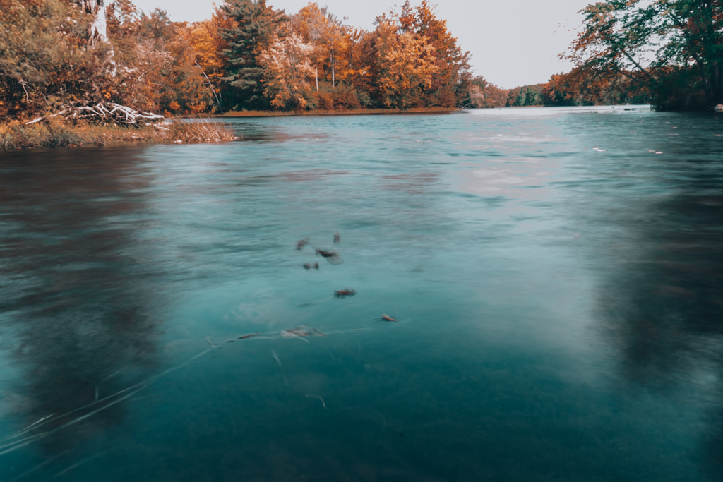
Content: majestic like movement and colors subjected around the water
Composition: Foreground Interest and Depth
Technique: clarity, contrast
Aesthetic: water movement, teal coloring